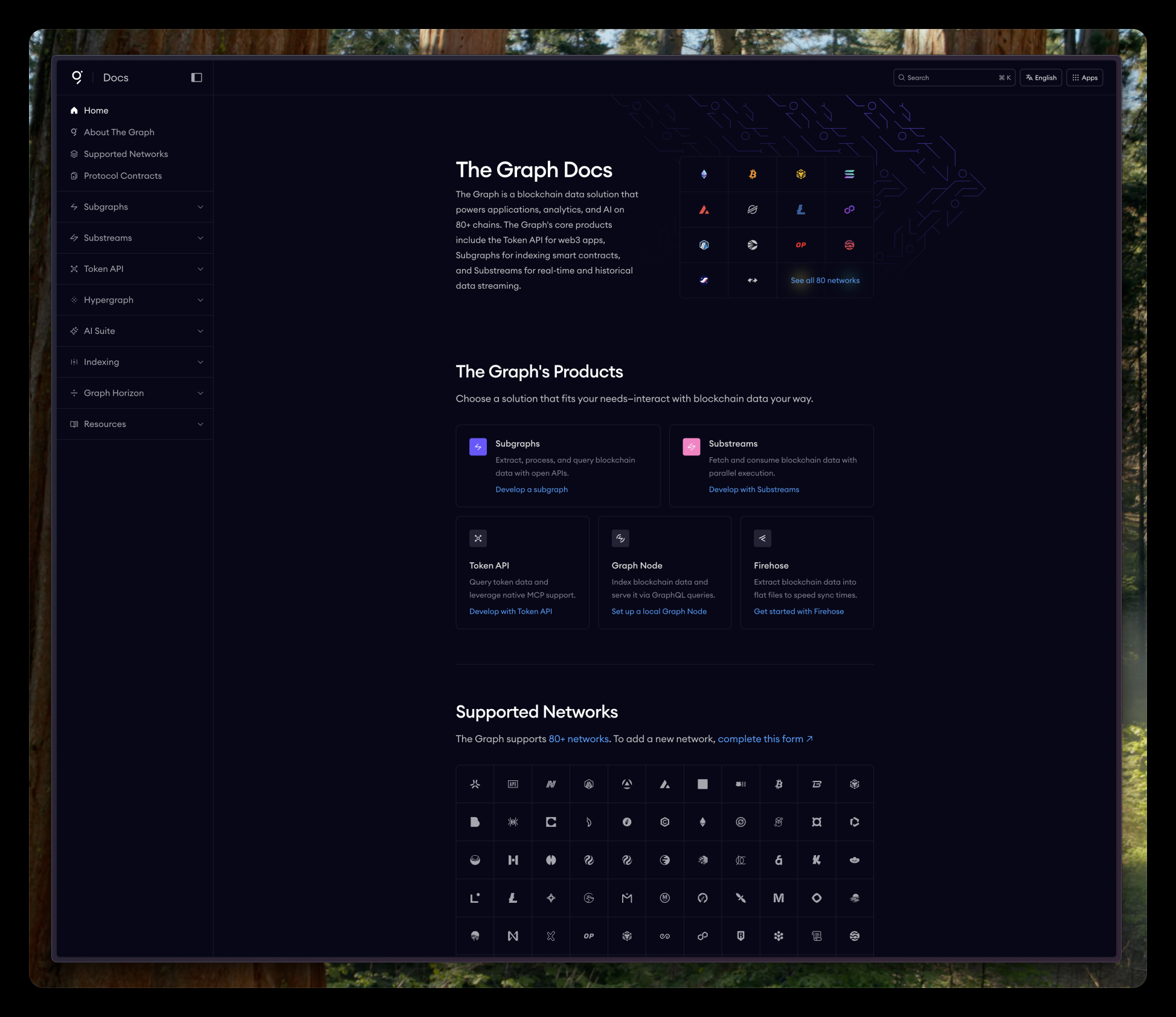
The Graph Docs
The Graph's developer documentation was prioritizing aesthetics over function. Hard to read, hard to navigate, and felt like marketing fluff. What started as a homepage request turned into a full overhaul focused on legibility, navigation, and actually serving developers.
Developers don't come to docs for vibes. They come to solve a problem and leave.
The Problem
The existing documentation looked polished at first glance. But it was style over substance.
- The side navigation was too close to the actual content, stealing attention while reading.
- Blurred image on a gradient background looks cool from afar, but was distracting and hurting legibility.
- Low contrast text made scanning difficult.
This was documentation for developers. They needed to find answers fast, not scroll past illustrations.
The Opportunity
I was originally asked to redesign just the homepage to accommodate some new links. But looking at the broader experience, it was clear the problems ran deeper.
I pitched a full redesign to the team. Walked through the issues with specific examples, explained why adding more links to a broken navigation would only make things worse, and made the case for doing it properly. Got the green light.
What Changed
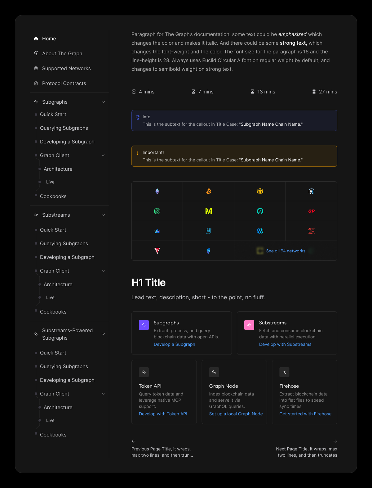
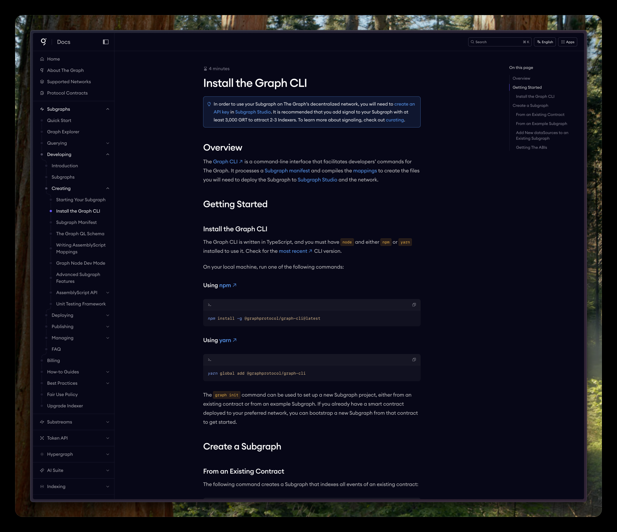
Information architecture: Restructured the content hierarchy based on how developers actually navigate docs. Eliminated the duplicate nav items. Created new iconography for the products and accomodated them in the grouped sidebar.
Side navigation: Cleaner, easier to scan sidebar navigation that doesn't steal attention away from the actual content. Expandable sections for drilling down, but never more than two clicks from anywhere.
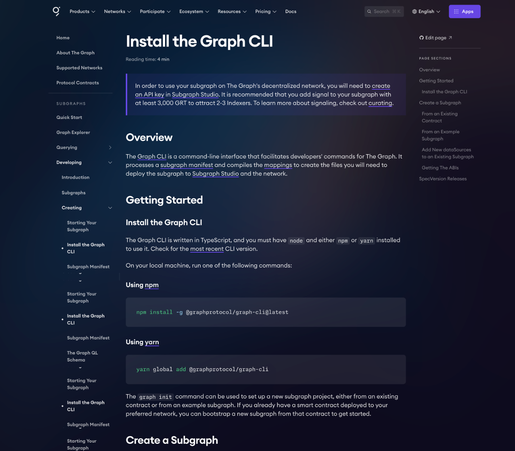
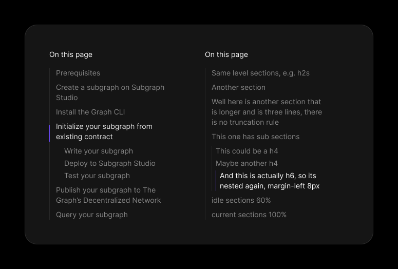
Page navigation — An "On this page" component that tracks your position and lets you jump between sections within long pages. Active states, proper nesting, clear hierarchy.
Prose and legibility: Established a clear type hierarchy so headings, body text, and code blocks are instantly distinguishable.
Component system: Built a set of reusable components: callout boxes for info and warnings, reading time indicators, product cards, network grids, and navigation patterns and of course prose rules to parse the MD content in a very readible manner.
Before and After
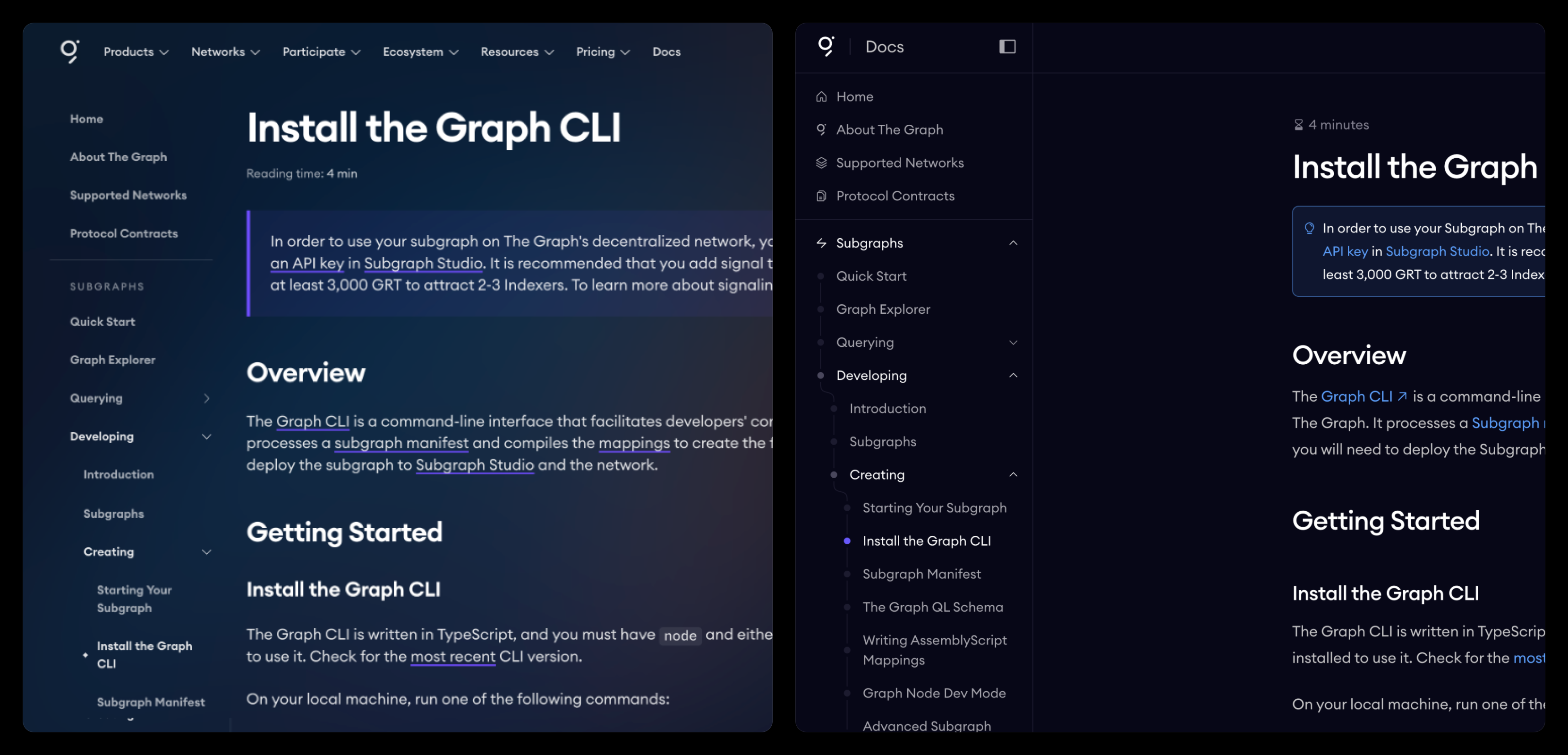
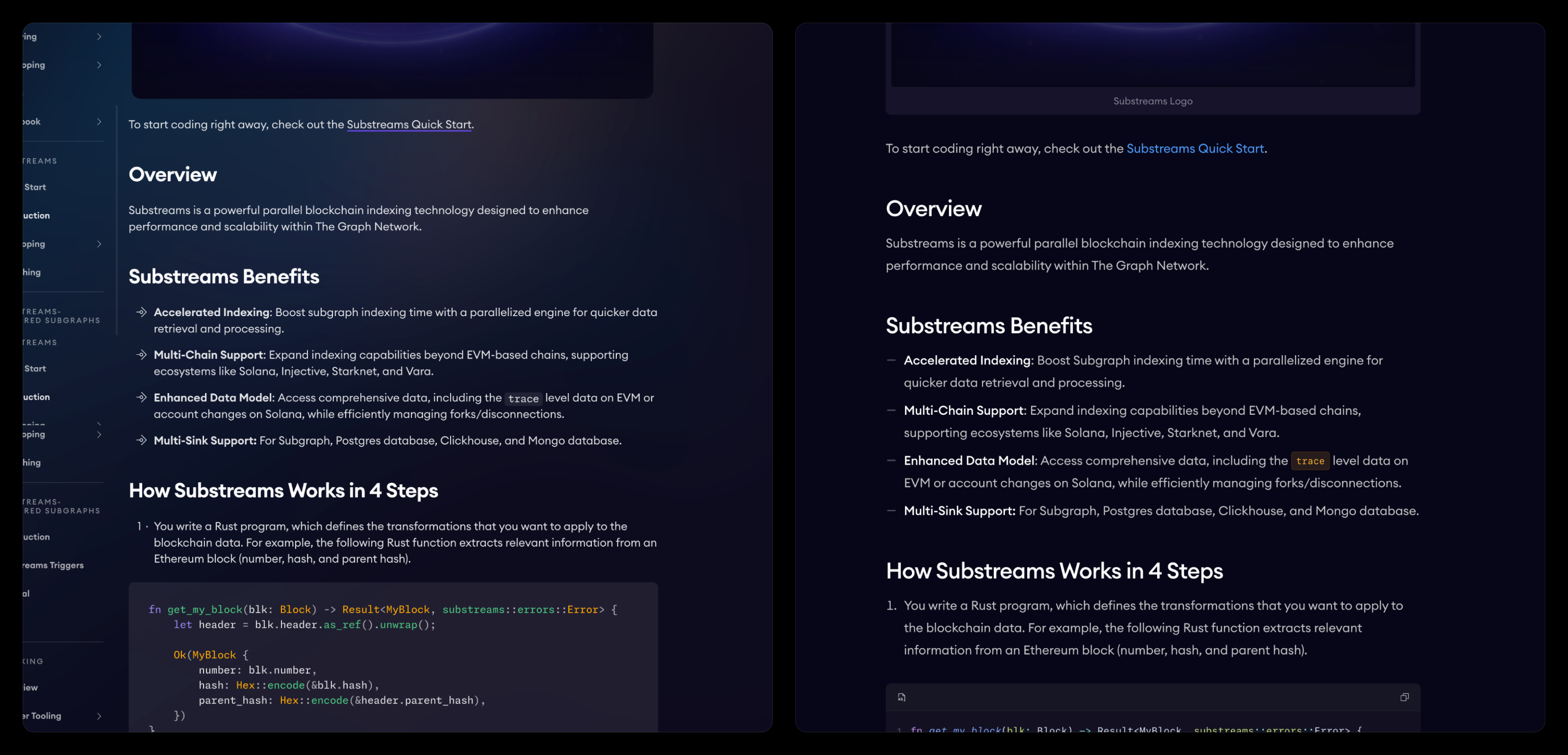
The Reading Experience
The goal was to make consuming documentation effortless. Clear hierarchy, scannable pages, and everything a developer needs visible without hunting.
Direct feedback from both the team and users confirmed the new design hit the mark. The most common reaction: "I can actually read this now."
Legibility was the goal. Legibility was the outcome.