
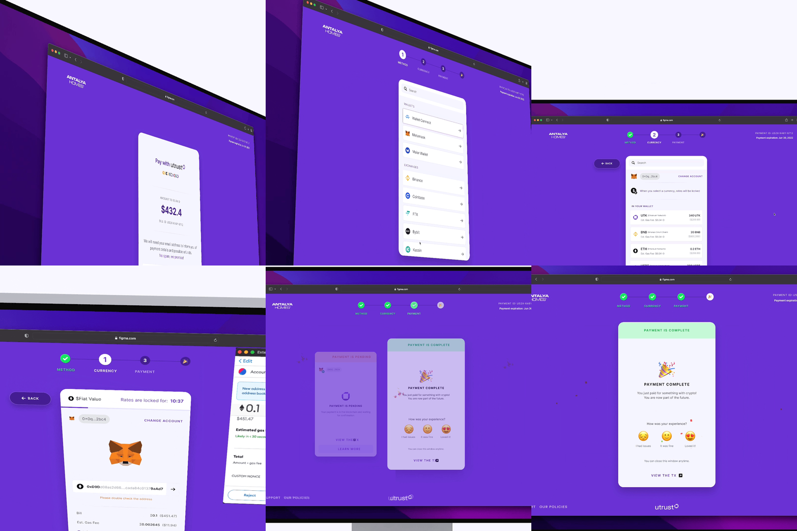
Context
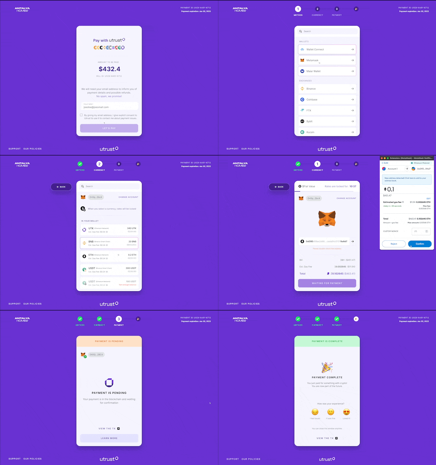
In my first week, I did a UX audit for every product Utrust had. Upon presenting my findings to the product team, I mentioned what could be done to improve the product from a UX perspective, and after discussing and evaluating the feasibility of the proposals with the team we redesigned and implemented the Payment Gateway and Payment Flow with close collaboration with the developer teams and project managers.
Highlighted Goals
We had a few key goals in mind for the redesign. We wanted to enable users to connect and use their De-Fi wallets in a very easy way, and we wanted to improve the navigation of the Payment Gateway and Payment Flow.
Wallet integrations
Enable users to connect and use their De-Fi wallets, in a very easy way.
Much better navigation
The previous implementation had its limits and because of those limitations, there were some pain points in the navigation. Namely; going back between steps. Displaying the steps in a payment process – or in any process in general really – is helping users to understand what's going to happen in the next step. Also, it ensures this process will not take much of their time.

Assumptions needed to be validated
Based on the UX Audit and discussions with other teams, we had a pretty good idea of what to build and improve. Right around we were starting the design sprint, we wanted to reach out to people who had previously paid for something using Utrust. They've been invited to answer some questionnaires and afterward, we interviewed some of them.
Some key takeaways from the interviews:
People prefer their own wallets to custodial wallets like CEX
- Some interviewees mentioned that even if they don't have any holdings in their wallets they would prefer to move their funds from centralized exchanges to their wallets and then make the payments. This was interesting because while it validates one of our assumptions it also shows the priority gap between wallets and custodial wallets.
Rainbow on Mobile, MM on Desktop
- Our assumption was MM would be a clear winner on both mobile and desktop followed by Trust Wallet on Mobile.
People prefer Bitcoin for big payments
- There might be some bias involved with this, big investors are usually keen to take fewer risks while small portfolios have more exposure to more volatile assets. When asked, which one they would prefer to use for payment if they had the same amount (in fiat) on both BTC and ETH, the majority answered ETH because of the block times.
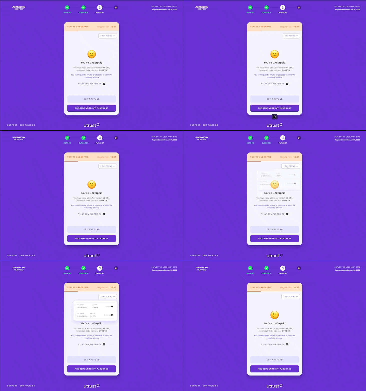
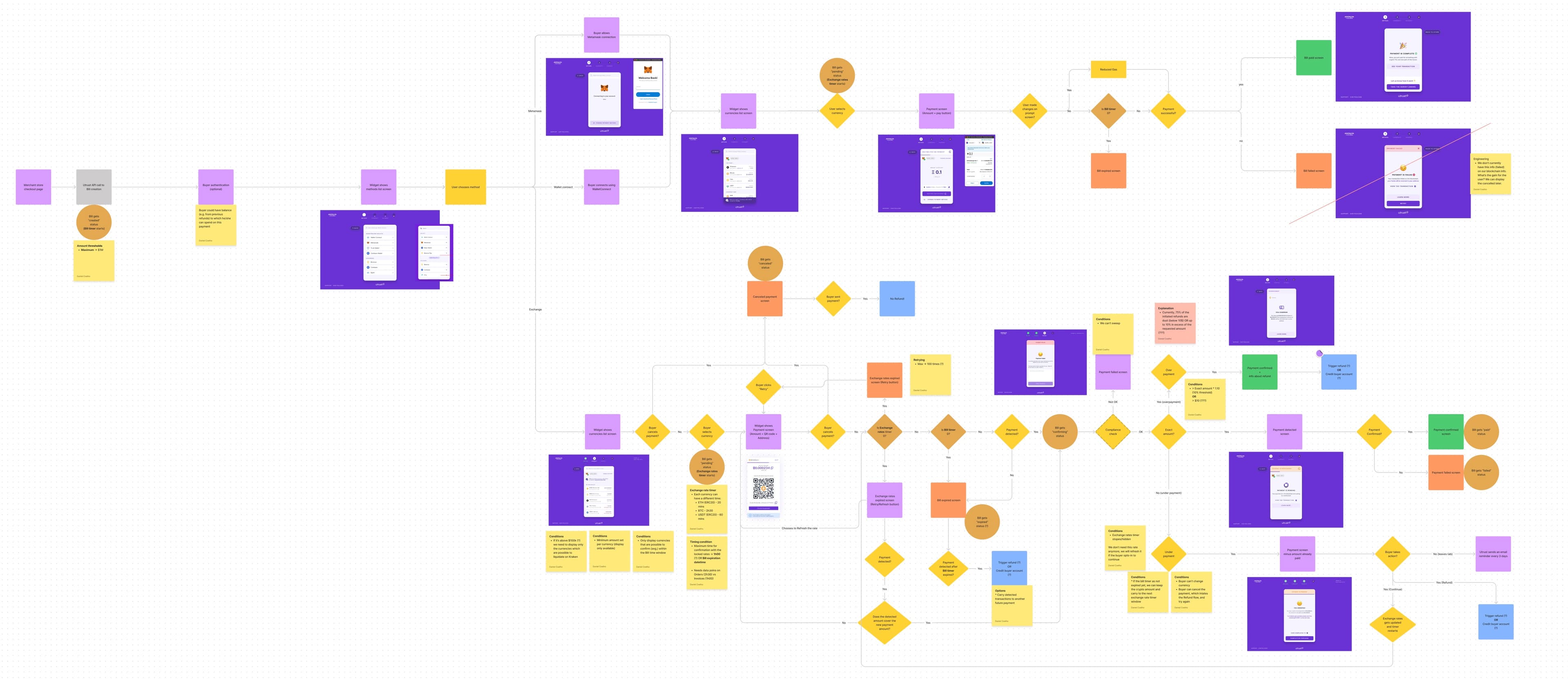
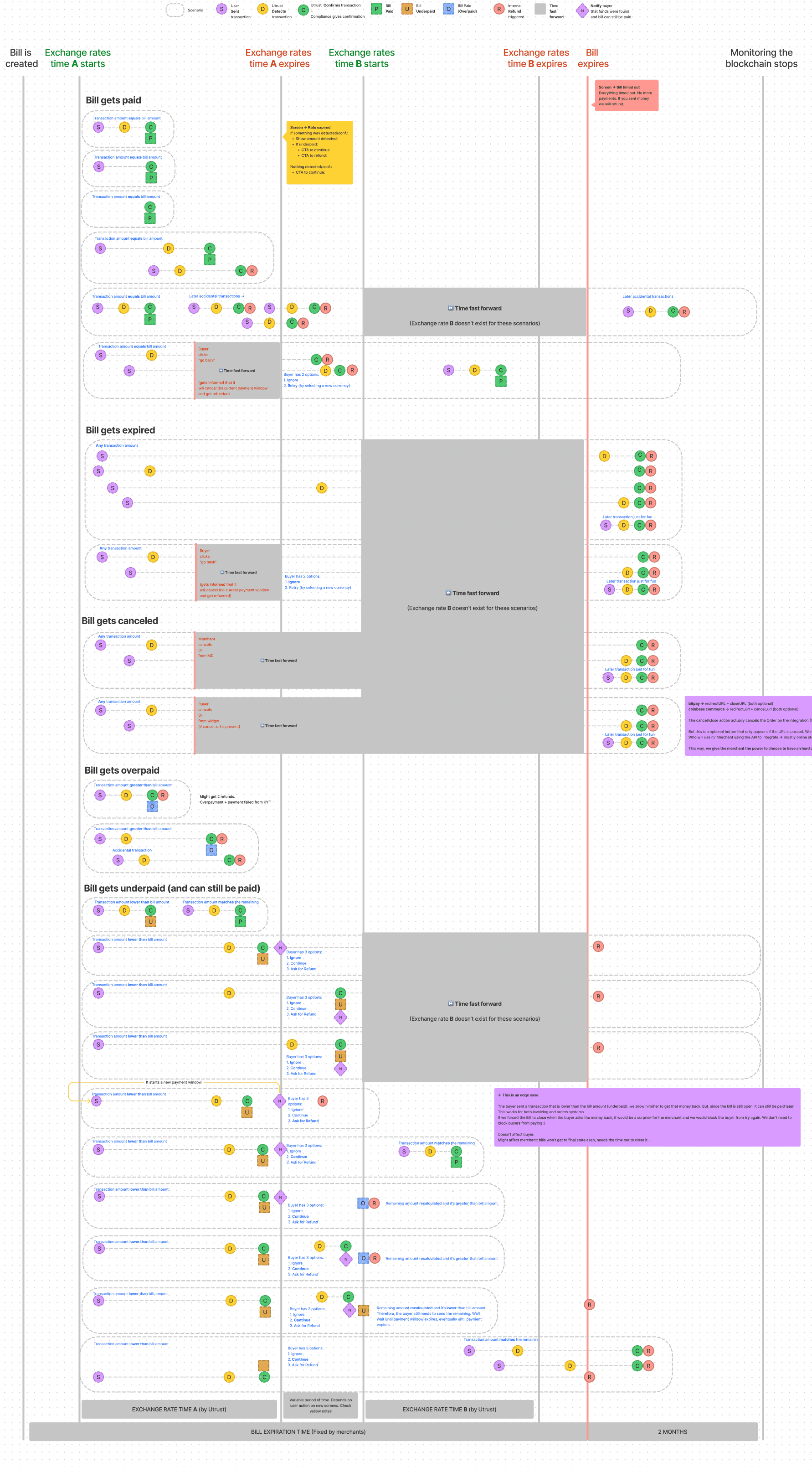
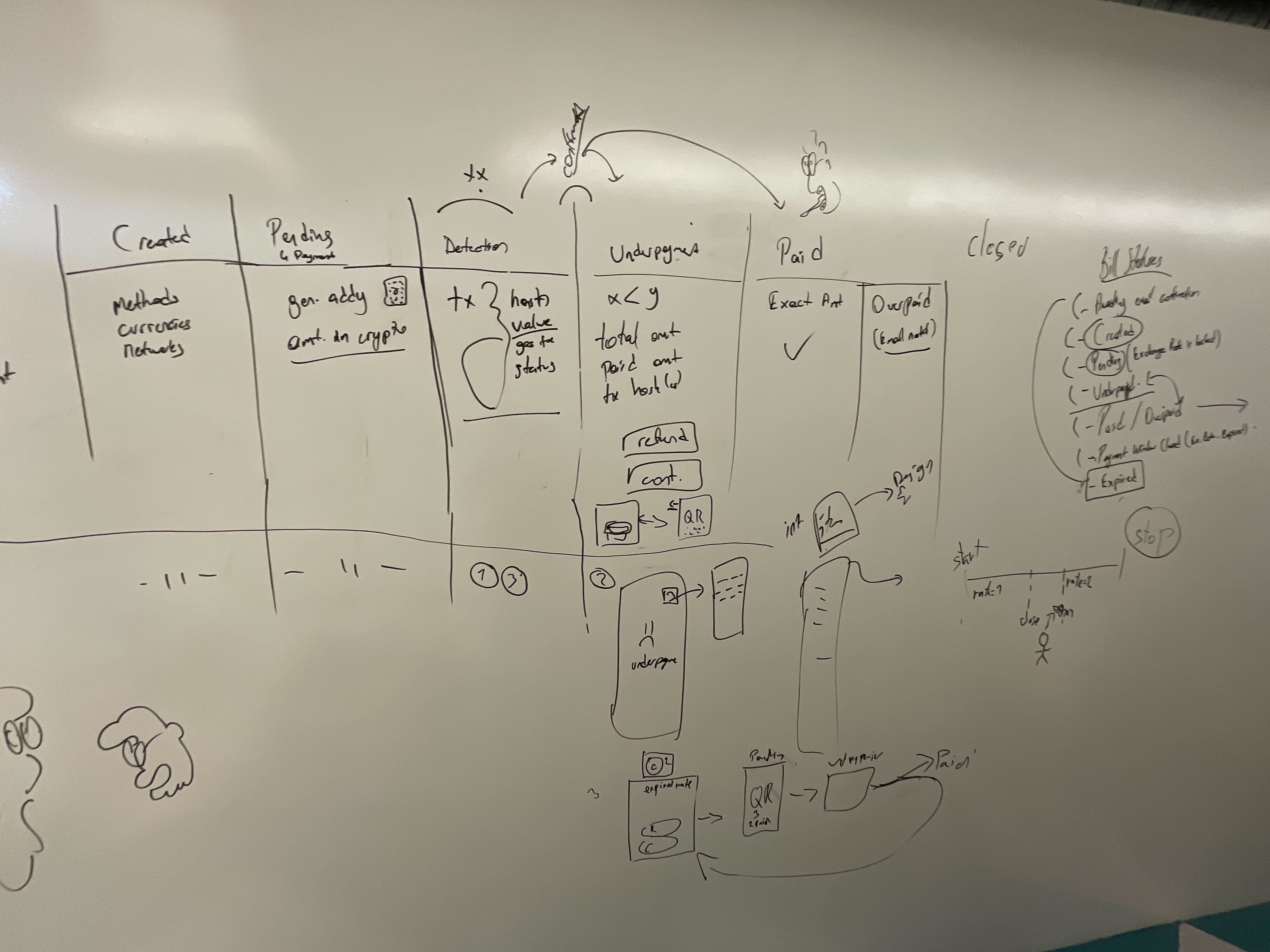
I've closely collaborated with the head of engineering (DRI of Payment Flow's backend), product manager of the project, and QA Manager and we worked on improving the flows I first imagined. We then decided to use a time-based diagram to see all the use cases and edge cases more clearly and cover guide and took decisions based on that.
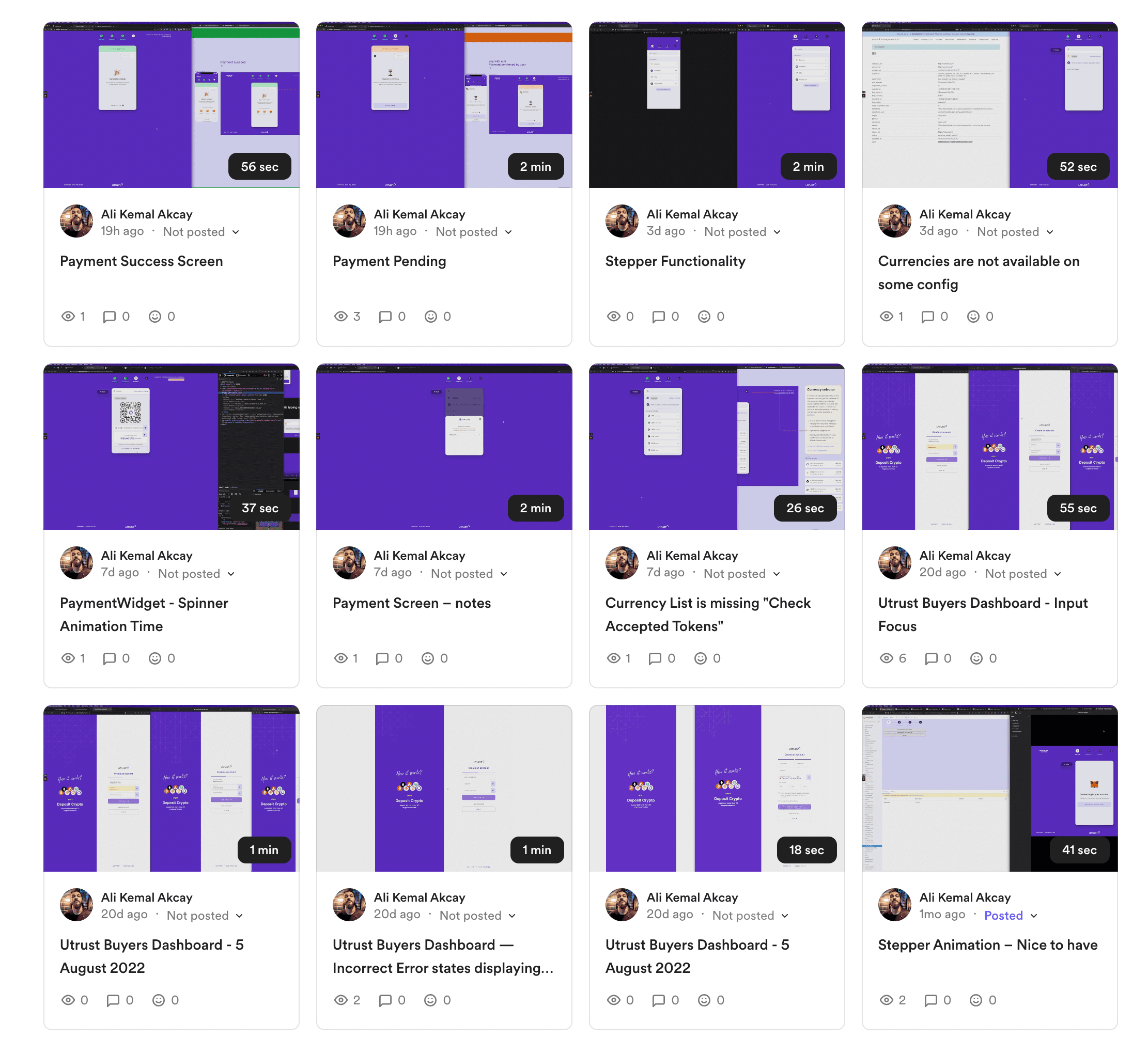
I paired up with @Rita (the QA & Delivery Manager of Utrust) to perform Design QA. I like to over communicate my findings with the developers/engineers because not everyone understands the same things from the same words. So I screen record and talk over it, as well as write up detailed repro paths and expected behavior/implementation. I also pay attention to explain the design decision behind why it should be as it's described. This pulls devs into the design process as well and it's sometimes just what the product is needed. A new set of ideas!
The achievements of the redesign
The achievements of the redesign included support for new currencies and new payment methods, a much easier payment flow, reduced fees for the company, and authenticated users for better communication and reliable after-sale customer support.
- Support for new currencies and new payment methods
- Much easier payment flow
- Reduce the fees that the company spends
- Authenticated users for better communication and reliable after-sale customer support